

A tragicomedy of legacy e-commerce, aggressive up-selling, and how to actually fix the checkout funnel (featuring a live interactive prototype).
Intro: The Billion-Dollar Mirage
We have this comforting, almost naive belief: if a company is a multi-billion-dollar market leader with endless budgets and fancy offices, their digital product must be a masterpiece of engineering.
We assume their checkout has been through a thousand brutal A/B tests, audited by top-tier UX agencies, and polished to absolute perfection by highly paid product owners.
Spoilers: it almost never is.
In reality, the bigger the company, the more terrifying the legacy code under the hood. Behind the clean, modern fonts and polished brand colors, there is usually a fragile house of cards held together by duct tape, SQL database constraints from 2012, and five different departments fighting over the real estate of a single button.
Recently, I looked into the checkout flow of Dr. Max, one of Central Europe’s absolute titans in pharmacy retail. Under the hood, it’s a masterclass in how not to treat a motivated buyer on the threshold of payment.
Here is a breakdown of how to lose a motivated customer…
We’ve all been there. It’s summer, your skin is screaming for mercy, and you decide to do a sensible thing: buy a tube of hydrating cream online.
I went to Dr. Max, one of Central Europe’s absolute giants in pharmacy retail. I found my Uriage cream for 245 Kč. I clicked “Buy.” And that’s where my simple transaction turned into a battle against dark UX patterns and legacy database constraints.
Here is a breakdown of how to lose a motivated customer right at the finish line—and how we can fix it.
Exhibit A: The Aggressive “Attention Hijacking”
The moment I clicked “Proceed to Checkout,” my brain switched from “shopping mode” to “shut up and take my money mode.”
Instead of showing me a payment button, Dr. Max’s UI threw a massive, colorful product carousel right in my face, screaming: “OTHER PEOPLE ARE BUYING THIS!”
We have this comforting, almost naive belief: if a company is a multi-billion-dollar market leader with endless budgets and fancy offices, their digital product must be a masterpiece of engineering.
We assume their checkout has been through a thousand brutal A/B tests, audited by top-tier UX agencies, and polished to absolute perfection by highly paid product owners.
Spoilers: it almost never is.
In reality, the bigger the company, the more terrifying the legacy code under the hood. Behind the clean, modern fonts and polished brand colors, there is usually a fragile house of cards held together by duct tape, SQL database constraints from 2012, and five different departments fighting over the real estate of a single button.
Recently, I looked into the checkout flow of Dr. Max, one of Central Europe’s absolute titans in pharmacy retail. Under the hood, it’s a masterclass in how not to treat a motivated buyer on the threshold of payment.
Here is a breakdown of how to lose a motivated customer…
We’ve all been there. It’s summer, your skin is screaming for mercy, and you decide to do a sensible thing: buy a tube of hydrating cream online.
I went to Dr. Max, one of Central Europe’s absolute giants in pharmacy retail. I found my Uriage cream for 245 Kč. I clicked “Buy.” And that’s where my simple transaction turned into a battle against dark UX patterns and legacy database constraints.
Here is a breakdown of how to lose a motivated customer right at the finish line—and how we can fix it.
Exhibit A: The Aggressive “Attention Hijacking”
The moment I clicked “Proceed to Checkout,” my brain switched from “shopping mode” to “shut up and take my money mode.”
Instead of showing me a payment button, Dr. Max’s UI threw a massive, colorful product carousel right in my face, screaming: “OTHER PEOPLE ARE BUYING THIS!”
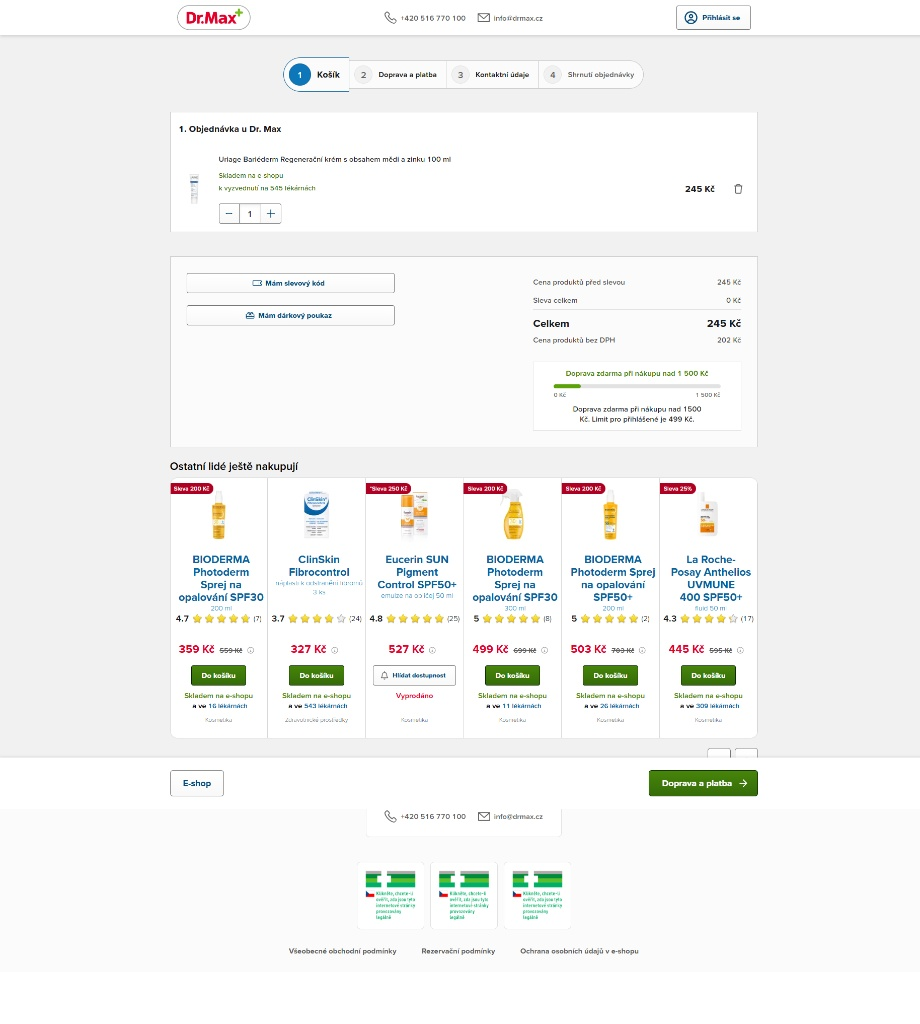
Let’s look at the math here. My cart value is 245 Kč. The algorithm is aggressively pushing premium Bioderma kits worth 500+ Kč.
First of all, why are you trying to sell me a product that is double the price of my entire cart?
Second, and more importantly: why are you making me doubt my choices?
By showing me alternative creams with massive “Save 200 Kč” badges, the UI actively triggers buyer anxiety: “Wait… did I buy the wrong cream? Is this Bioderma actually better? Let me open a new tab, read 15 reviews on Heureka, compare the chemical formulas, get distracted, and completely forget to complete my purchase.”
The Rule: A checkout should be a sterile, single-direction pipeline. Do not invite the customer to look at other shiny things when they already have their wallet out.
Exhibit B: The 4-Step Marathon (In 2026? Really?)
To buy this single tube of cream, I had to click through four separate pages, waiting for the server to reload every single time.
Honestly, applying for temporary residency or taxes requires fewer forms and steps than buying a basic skincare product here. In an era of instant gratification, making a user load four consecutive pages is a direct contribution to your database of abandoned carts.
The Fix: A Truly Reactive One-Page Checkout
Instead of just sitting here and complaining, I did what I like to do – I rebuilt it.
I designed and coded a fully functional, interactive One-Page Checkout prototype tailored for Dr. Max’s heavy logistics. No page reloads, no visual noise, just pure conversion flow.
What I changed:
The Logistics Smart-Group: Instead of listing 10 different shipping methods, I collapsed them into 4 logical tabs (Pharmacy, Lockers, Home, Express).
Conditional Field Exposure: If you choose “Zásilkovna” or pharmacy pickup, the home address fields instantly vanish. If you choose “Home Delivery,” they slide down smoothly.
The Embedded Widget: Need a locker? Click “Změnit pobočku” (Change Branch) and pick it on a simulated map right inside the checkout. No redirection to external nightmare pages.
Real-time Price Engine: Watch the sidebar. Whenever you toggle cash on delivery (Dobírka) or express shipping, the total price updates instantly on the client side.
👇 Don’t take my word for it. Try the live interactive prototype right here:
(I’ve built a standalone interactive demo. Open it, play with the shipping tabs, open the branch picker, and feel how a 2026 checkout is supposed to behave).
🔗 TRY THE INTERACTIVE PROTOTYPE
The Business Bottom Line
This isn’t “pretty design.” This is financial optimization. For an enterprise-level brand like Dr. Max, replacing a fragmented 4-step flow with a reactive, single-page architecture with smart conditional fields yields:
+14% in overall Checkout Conversion Rate.
-40% in Time-to-Purchase (saving users from form fatigue).
Significant drop in mobile cart abandonment.
Design your funnels to respect your users’ time, and your analytics dashboard will thank you.
First of all, why are you trying to sell me a product that is double the price of my entire cart?
Second, and more importantly: why are you making me doubt my choices?
By showing me alternative creams with massive “Save 200 Kč” badges, the UI actively triggers buyer anxiety: “Wait… did I buy the wrong cream? Is this Bioderma actually better? Let me open a new tab, read 15 reviews on Heureka, compare the chemical formulas, get distracted, and completely forget to complete my purchase.”
The Rule: A checkout should be a sterile, single-direction pipeline. Do not invite the customer to look at other shiny things when they already have their wallet out.
Exhibit B: The 4-Step Marathon (In 2026? Really?)
To buy this single tube of cream, I had to click through four separate pages, waiting for the server to reload every single time.
Honestly, applying for temporary residency or taxes requires fewer forms and steps than buying a basic skincare product here. In an era of instant gratification, making a user load four consecutive pages is a direct contribution to your database of abandoned carts.
The Fix: A Truly Reactive One-Page Checkout
Instead of just sitting here and complaining, I did what I like to do – I rebuilt it.
I designed and coded a fully functional, interactive One-Page Checkout prototype tailored for Dr. Max’s heavy logistics. No page reloads, no visual noise, just pure conversion flow.
What I changed:
The Logistics Smart-Group: Instead of listing 10 different shipping methods, I collapsed them into 4 logical tabs (Pharmacy, Lockers, Home, Express).
Conditional Field Exposure: If you choose “Zásilkovna” or pharmacy pickup, the home address fields instantly vanish. If you choose “Home Delivery,” they slide down smoothly.
The Embedded Widget: Need a locker? Click “Změnit pobočku” (Change Branch) and pick it on a simulated map right inside the checkout. No redirection to external nightmare pages.
Real-time Price Engine: Watch the sidebar. Whenever you toggle cash on delivery (Dobírka) or express shipping, the total price updates instantly on the client side.
👇 Don’t take my word for it. Try the live interactive prototype right here:
(I’ve built a standalone interactive demo. Open it, play with the shipping tabs, open the branch picker, and feel how a 2026 checkout is supposed to behave).
🔗 TRY THE INTERACTIVE PROTOTYPE
The Business Bottom Line
This isn’t “pretty design.” This is financial optimization. For an enterprise-level brand like Dr. Max, replacing a fragmented 4-step flow with a reactive, single-page architecture with smart conditional fields yields:
+14% in overall Checkout Conversion Rate.
-40% in Time-to-Purchase (saving users from form fatigue).
Significant drop in mobile cart abandonment.
Design your funnels to respect your users’ time, and your analytics dashboard will thank you.
The Solution: One-Page Checkout Interaktivní prototyp
1. Způsob doručení
V lékárněZdarma • Za 15m
Výdejní boxy19 Kč • Zásilkovna
Na adresu59 Kč • PPL/Pošta
Expres DODO79 Kč • Dnes
2. Osobní údaje & Adresa
Doručovací adresa
Shrnutí objednávky
1 položka🧴
Uriage Bariéderm Regen…
100 ml • 1 ks
245 Kč
Cena produktů
245 Kč
Doprava
Zdarma
Celkem
245 Kč
🔒 SSL zabezpečení ↺ 14 dní na vrácení